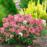
Crisp muslin and fine grain are two colors that cause much debate. In this article, we will compare them to clear any doubt you might have. The article will also walk you through other frequently asked questions concerning colors.
Table of Contents
Crisp Muslin Vs Fine Grain: Table Comparison
| Features | Crisp Muslin | Fine Grain |
| HEX code | #E9E2D7 | #D8CFC1 |
| HEX color name | Pearl Bush | Sisal |
| CMYK percentage | 0,3, 8, 9 | 0, 4, 11, 15 |
| RGB float | 0.914, 0.886, 0.843 | 0.847, 0.812, 0.757 |
| RGB decimal | 233, 226, 215 | 216, 207, 193 |
| LRV | 71 | 57.45 |
What Color is Crisp Muslin?
A slight hint of green can be seen in the color of crisp muslin (peach Bush). This cool taupe is a modern and fashionable color that looks fantastic in every house room and on stucco, block walls, fascia, and trim. It also reflects light soo beautifully.
What is Agreeable Gray?
Agreeable Gray is gray with a warm undertone. It could lean more toward its gray or beige side, depending on the lighting. Generally, it is a little grayer in dark areas and warmer in warm, bright light. That being said, it is among the purest varieties of greige.
What Color is a Gray Whisper?
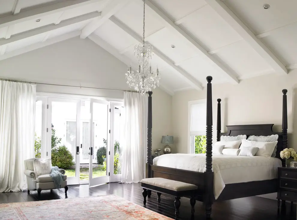
Gray Whisper has a silvery undertone and is a pale grayish lavender purple. It is the perfect color to use for any trim or main walls. White frame and deep-toned mahogany furniture go well together.
What is the Color Gray Mist?
This shade is a component of the Off-White Color family. The Off-White line delivers subtle white variations that suit calm, serene settings and provide color-enhancing touches for dynamic interiors. It is inherently elegant and eternally adaptable.
What is Accessible Beige?
Accessible Beige is a plain beige with a touch of gray. It is an incredibly adaptable color that, when utilized appropriately, will give any house a lovely, traditional feel.
Why Do Grey Walls Appear Purple?
Reds and yellows are enhanced by incandescent lamps’ warm, yellow light, while blues and greens get muted. Warm yellow or white light helps to minimize the blue tinge in a purple-gray wall, making it appear grayer because purple is a blend of blue and red.
Which Grey Paint Doesn’t Have Undertones?
Benjamin Moore Stonington Gray HC-170 is the top option for the most stunning gray paint color without undertones. This one is part of the brand’s Historical Collection.
How to Make your Gray Walls Look Less Purple
Gray is commonly known as a chameleon color since it appears differently depending on the lighting. The colors of the surrounding furnishings also influence the tones in the gray wall paint. The most straightforward technique to prevent a purple-gray wall is to ascertain the paint’s undertone before applying it to the wall. If your wall already has purple overtones, you can utilize lighting and other colors to help balance them.
Identify the Undertone
A blue, green, purple, or brown undertone may be in gray paint. Choose a few gray paint chip cards in colors that you like, and take them home.
This makes it easier for you to distinguish the nuances between the various shades of gray when compared to a white piece of paper. Examine the paint chips in the room you intend to paint under the room’s lighting. Hold the cards next to furnishings, fabrics, decor, and wood to reduce your selection to three or four hues. Choose grays that look more tan or beige to avoid a purple-toned wall.
Paint Sample Boards
Get sample cans of the colors you’ve decided on and a sample board for each color to test at home. Unless the wall is white, the color of the existing wall may also affect the color painted on the board.
When examining the color on the wall, position a poster board slightly above the sample board. Move the boards around if necessary and observe the colors in various lighting situations. Leave them up for at least three days to give the paint time to cure. Avoid using purple-reading colors in your surroundings at any time of day or night.
Impact Through Color
Yellow should not be used in a space with purple-gray walls. They are opposite one another on the color wheel. Each color appears brighter and more intense when placed close to another.
The purple undertone in the gray paint is accentuated with yellow-toned objects like yellow upholstery, fabrics, or artwork. Instead, utilize tan or brown wood in the space to make the gray walls appear warmer. S
oft upholstery and fabrics in shades of white, cream, tan, and brown give the wall a more grayish and less purple appearance. To help the wall’s purple undertones be neutralized and seem grayer, bring more purple or blue materials into the room.
To impact the neutral gray of the walls, hang black-and-white images in white mats and black frames.
Make a Lighting Change
The first thing you can do to help reduce the purple undertone on an existing gray wall if repainting is not an option is to adjust the lighting in the space. Reds and yellows are emphasized by incandescent lamps’ warm, yellow light, while blues and greens are muted.
Warm yellow or white light helps to minimize the blue tinge in a purple-gray wall, making it appear grayer because purple is a blend of blue and red. Now “warm white” compact fluorescent bulbs with lower light temperatures are available. They produce light of the same caliber as incandescent bulbs.