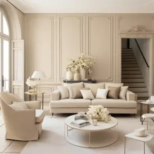
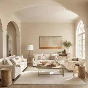
Ivory and Light Almond is a color on the white to yellow spectrum but a very dull shade of yellow. Its name derives from ‘ivory’, the dentine-like material that elephant tusks and animal teeth are made of.
Light almond is a color that can be described as closer to white or off-white. Placed adjacent to pure white, it appears like a tarnished white surface.
Table of Contents
Ivory Vs Light Almond Overview

The two colors are close in hue with ivory being slightly darker than light almond. Light almond has a beige undertone while ivory has yellow and gold undertones.
The most common use for these two colors was in the making of light switch paneling.
Since plastic tended to fade and discolor with time, most houses were fitted with ivory or light almond switch panels to pre-empt this.
Depending on the shade of beige wall paint or wallpaper, decorators would have to pick either of these two choices for switch plates.
The practice is now outdated and wall painting has evolved to include a multitude of colors unlike in previous decades when beige was the most common choice for wall painting.
Today switch panels come in a variety of colors and styles with the most abundant switch panels being a simple white.
Ivory Vs Light Almond: Which is Better?
Color or colors are benign and derive their qualities from the ways we use them, what we associate them with,
and the way we feel upon looking at them. Between the two, however, ivory is more popular and versatile compared to light almond.
Ivory is a timeless color and comes in several shades. Sherwin Williams has an array of more than nine shades of ivory including Grecian Ivory, Medici Ivory, Classic Ivory, Inviting Ivory, Impressive Ivory, and Ivory Lace.
Ivory Lace is the most popular shade of ivory in the Sherwin Williams Line.
The elegant allure of ivory emanates a warm and comforting ambiance, evoking sophistication that has gained immense popularity among homeowners and interior decorators.
Ivory cuts a perfect balance between white, yellow,
and gold without overwhelming the senses in favor of any of those stronger colors.
There is a downside, however to using ivory in the home.
Its neutral bright appearance means it is a poor camouflage for stains and requires utmost care especially on seats and on the walls.
Ivory
Only use ivory in the home if you are guaranteed no toddlers will douse the place with soft drinks and all manner of food stains.
As a warm color, ivory easily pairs with other warm and soft tones such as tan, soft yellows, beige and blue, perfectly.
Ivory is also neutral and pairs readily with stronger shades such as red, green, and chocolate brown.
Compared to white, ivory is warmer and has replaced white with many decorators instead opting to dilute the crisp coolness of white with the warmth of ivory.
Ivory against white is the image of perfection and this pairing has become increasingly popular in recent years.
The gold undertones of ivory, that denote grandeur and wealth,
make it an exemplary choice for ceremonial and regal garb such as wedding and bridesmaids’ dresses, royal mantles, and even papal regalia.
Workspaces by and large have not adopted the use of ivory for furniture owing perhaps to the warm soothing nature of the color. Ivory likely detracts from the cooler nature of the office and seems an odd inclusion in the workplace.
Light Almond

Light almond presents like a stained white. It is an off-white shade with beige undertones,
a very light beige and light almond are easily the same color.
Almond implies that there may be a shallow undertone of brown but ever so slightly.
Light almond is not as popular as ivory because it tends to appear as a discolored white façade.
Almond on the other hand is a beloved go-to for many homeowners. Sherwin Williams almond paints come in a spread of shades including Almond Roca and Roasted Almond, two of their most popular almond shades.
Though uncommon, light almond is a neutral warm hue that naturally forms an easy backdrop for other stronger colors and would therefore be a good choice for walls.
Light almond is an excellent choice for rugs and carpets, accentuating the room with a surge of warmth and neutrality. Paired with strong blues, green, and red, light almond compliments them perfectly.
The off-white hue of light almond makes it an agreeable choice for outdoor furniture which would naturally stain from exposure to the elements.
Light almond paint would camouflage that discoloration flawlessly.
In some cases, the signature stained white façade comes off as a sophisticated choice such as on bathroom tiles and some kitchen surfaces.
Paired with beige itself, light almond is distinctly soft and attractive without grabbing attention and overwhelming the senses.
Final Thoughts
While both are warm and neutral, ivory is infused with more warmth and is, therefore, more attractive than light almond.
Ivory, like gold, also appears to evoke impressions of royalty and opulence. Consequently, ivory is often used to create a lively, ecstatic mood.
Many factors come into consideration when choosing between the two colors most importantly personal preference and individual taste.
In the case of the walls of your home, factors such as lighting, the purpose of the room, size of the room,
other colors in the room, and your room plan must weigh into your final decision.
Before picking one over the other, an exercise in sampling both shades on the wall is possibly the most essential.
Simply make small patches of both paints on the walls of every room and leave them for a few days,
continually observing how they behave in different lighting both natural and artificial.
This will also give you an idea of how each of these colors clashes or compliments other colors in the room such as the color of your furniture.
Whichever way you lean, decorating is a painstaking process. Take time to review each color separately and your décor will likely impress beyond your expectations. Have a blast!


